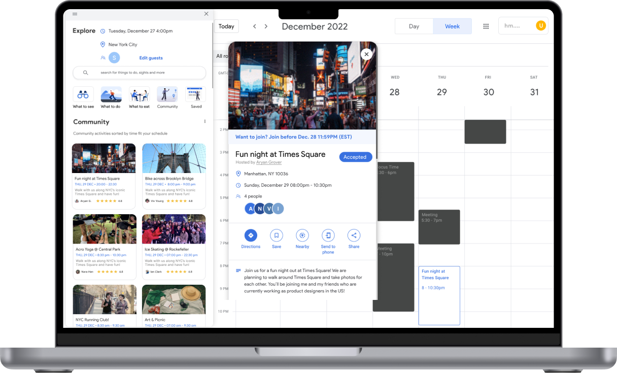
Google Calendar's Leisure Mode, uncovering
delightful activities in your area
Client:
Carnegie Mellon University
Timeline:
4 months
Year:
2022
Carnegie Mellon University
Timeline:
4 months
Year:
2022
My Role:
UX Design, UX Research
Team:
2 Designers & 3 Researchers
UX Design, UX Research
Team:
2 Designers & 3 Researchers
Project Overview
I was tasked to reimagine the Google Calendar interface and design an innovative solution that guides users through planning workstation activities. By developing this solution, I aimed to revolutionize how people approach workation planning, making it more intuitive, fun, and efficient.
Workation (work + vacation): combining work and leisure in a new location for some time.
Solution
Google Unplug is a new feature within Google Calendar designed to assist users in organizing activities while they are on a workstation. Users can seamlessly transition their calendar into "leisure" mode with a simple click, allowing them to effortlessly discover enjoyable activities tailored to their workation destination, all conveniently integrated into their calendars.
Results
I decreased interaction cost by ~ 50% by making it easier for users to find interesting activities in their area straight from Google Calendar.
I uncovered key pain points for travelers who like to work while they are on vacation, like the importance of community and spontaneity.
Problem Statement
How might we make trip planning more efficient for remote workers?
Why remote workers?
Since the onset of the pandemic, remote work has established itself as a commonplace practice in the United States, with employees increasingly valuing work-life balance over extended hours spent in traditional office settings.
As per our research findings, an increasing number of individuals are opting for remote work or a hybrid work arrangement. By the year 2025, it is projected that approximately 32.6 million Americans will be engaged in remote work, as indicated by Upwork. This figure accounts for roughly 22% of the total workforce.
Why Google Calendar?
We opted to design a feature within the Google Calendar ecosystem that would make planning activities easier for remote workers because we found that 70% of travelers use some sort of digital calendar platform to organize their trip; of that, 15% of calendar users use Google Calendar for planning. With an estimated 500M monthly users, it made more sense to bring a new product solution to Google Calendar instead of trying to design a stand-alone solution for remote workers.
Key Features
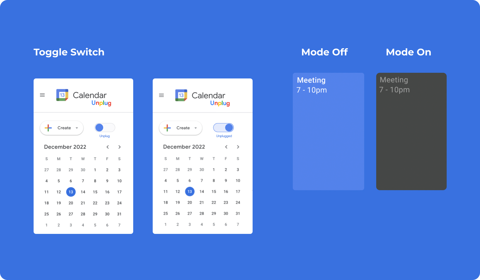
Toggle to leisure mode
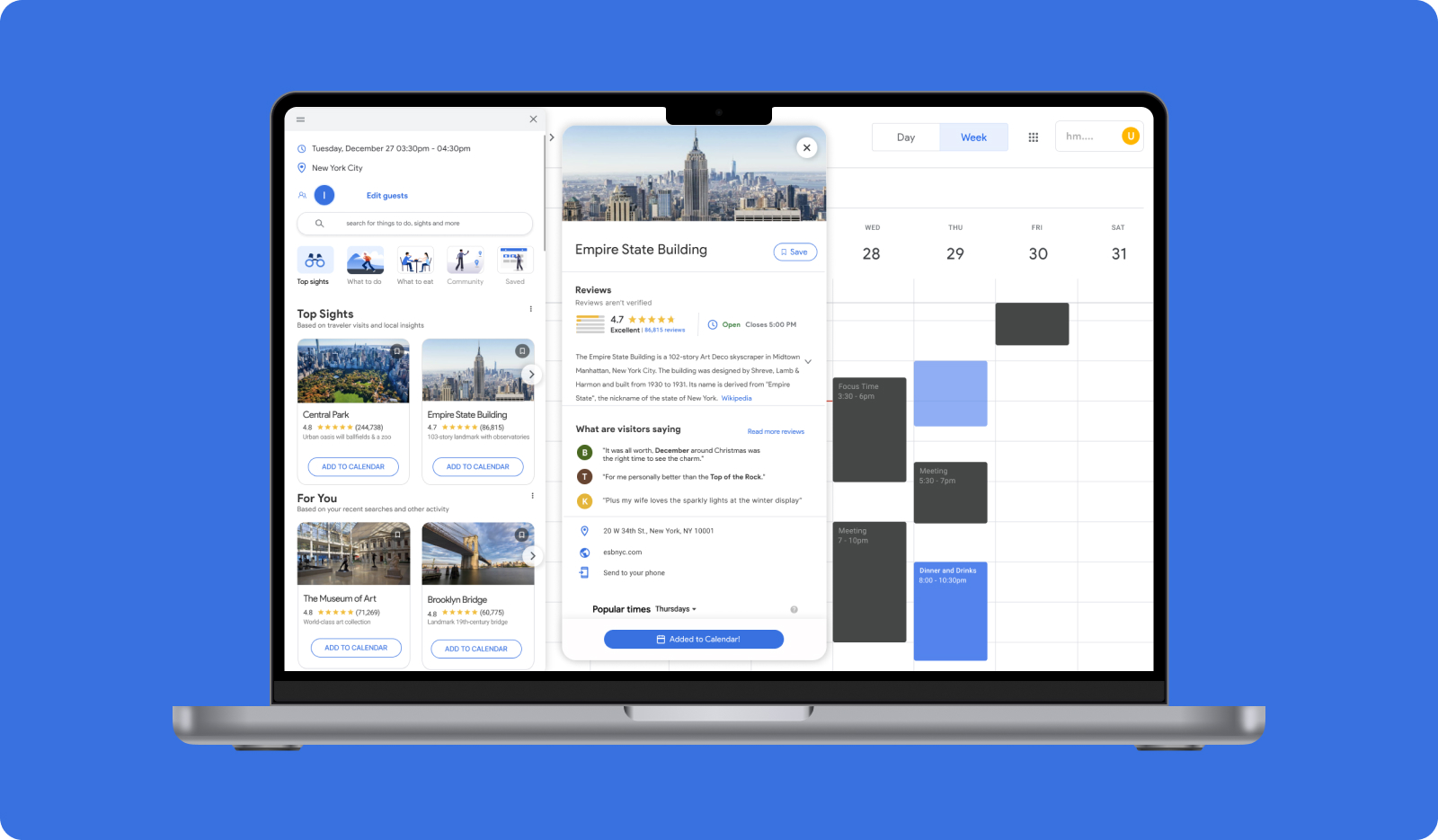
Switch effortlessly between regular Google Calendar mode and leisure mode, where you gain the flexibility to view your available time slots dedicated to planning enjoyable activities. This transition is designed to emphasize your personal interests and de-prioritize work-related commitments with a visual shift from blue to black. By implementing this feature, we are actively promoting a healthier work-life balance.
Browse suggested activities
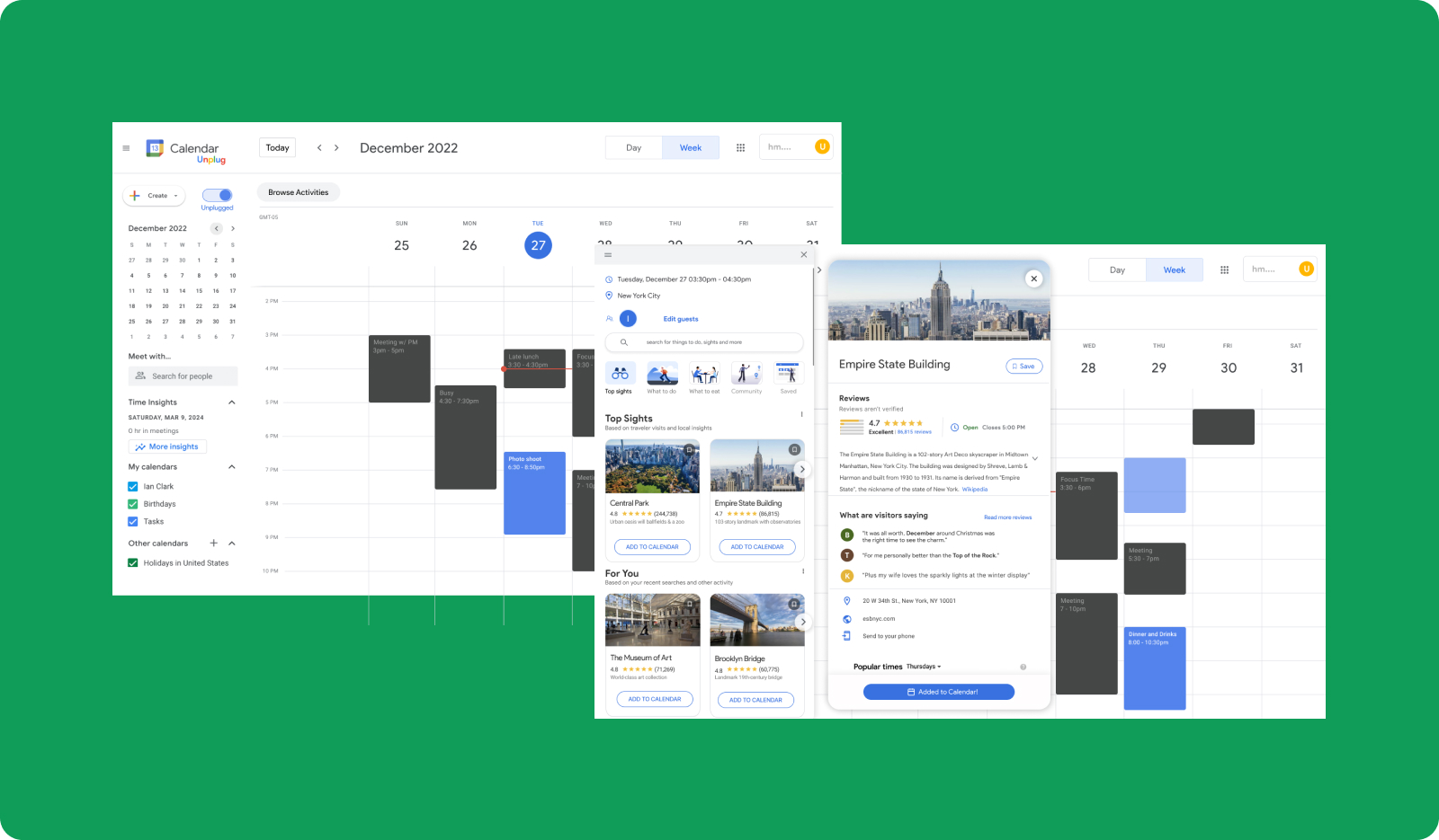
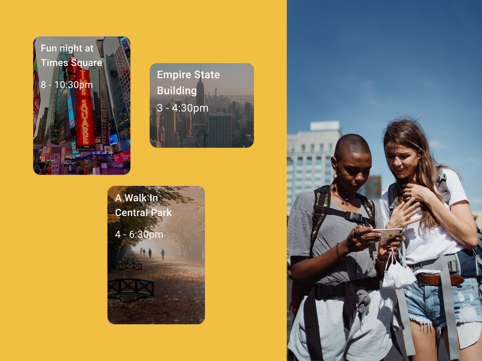
Upon switching to leisure mode, users can seamlessly explore recommended activities, all within the same screen, leveraging location data, past preferences, and the current time of day. There's no need to navigate to a separate screen; everything you need is at your fingertips, with suggested time slots blinking and providing feedback.
Join or create your own events
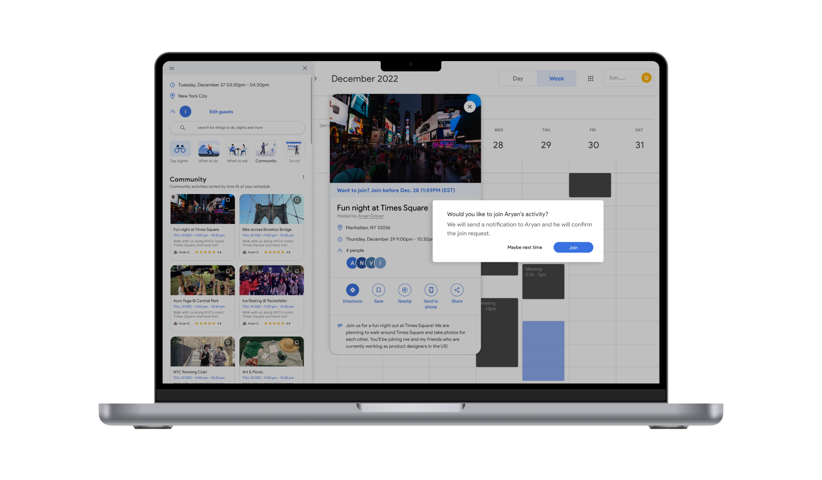
Connecting with friends and participating in their planned events is effortless. You can seamlessly send a request to join your friend's event and await their approval. This feature fosters a sense of social connectivity and ensures that you can easily partake in shared experiences.
Final Designs


Lead With Research
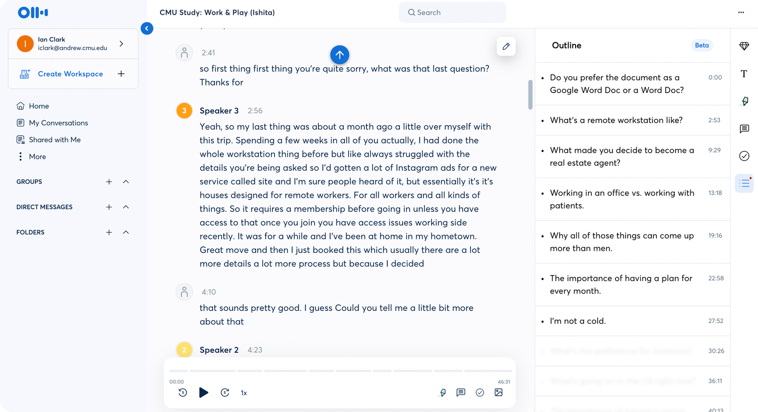
Semi-Structured Interviews
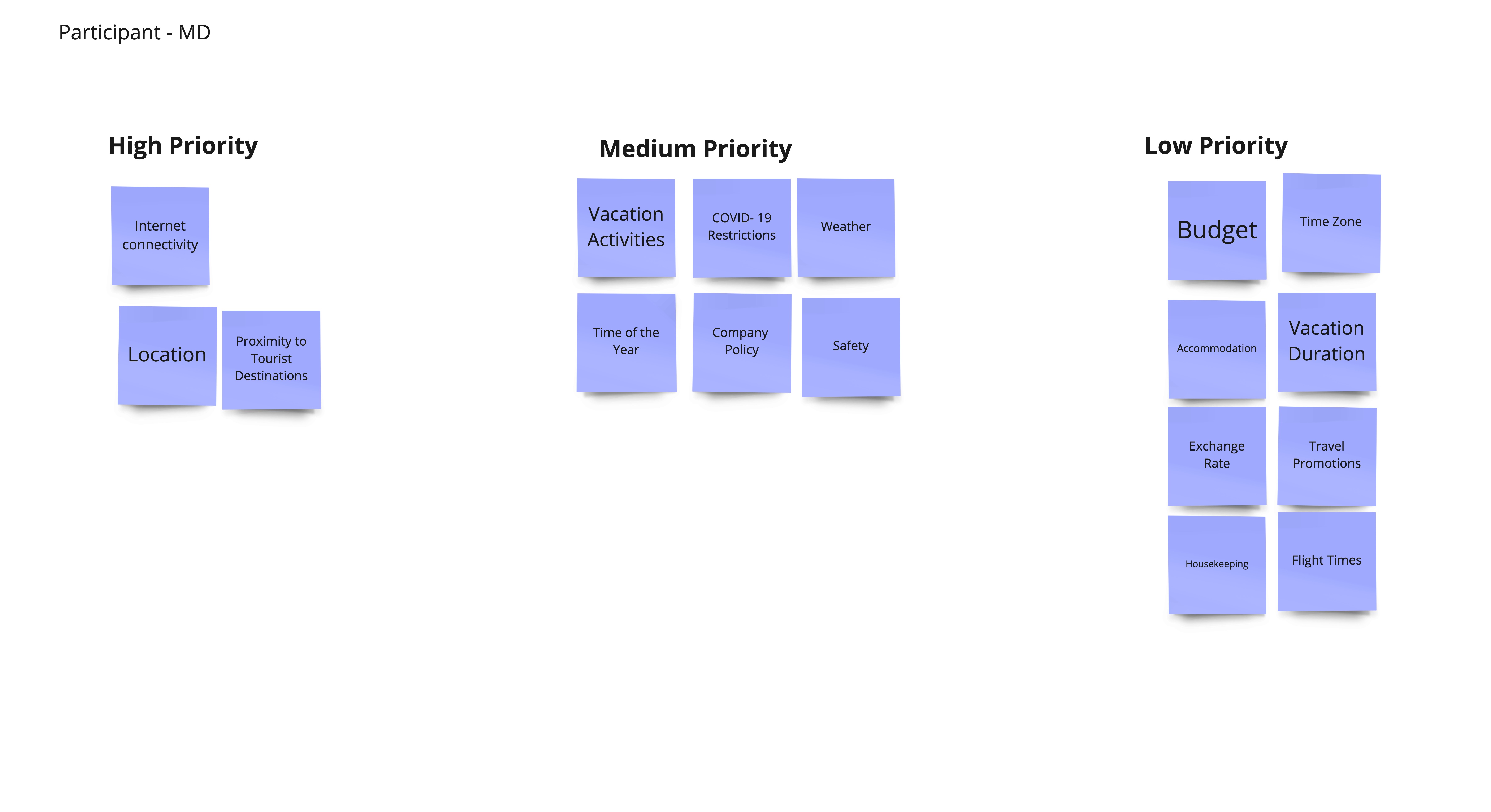
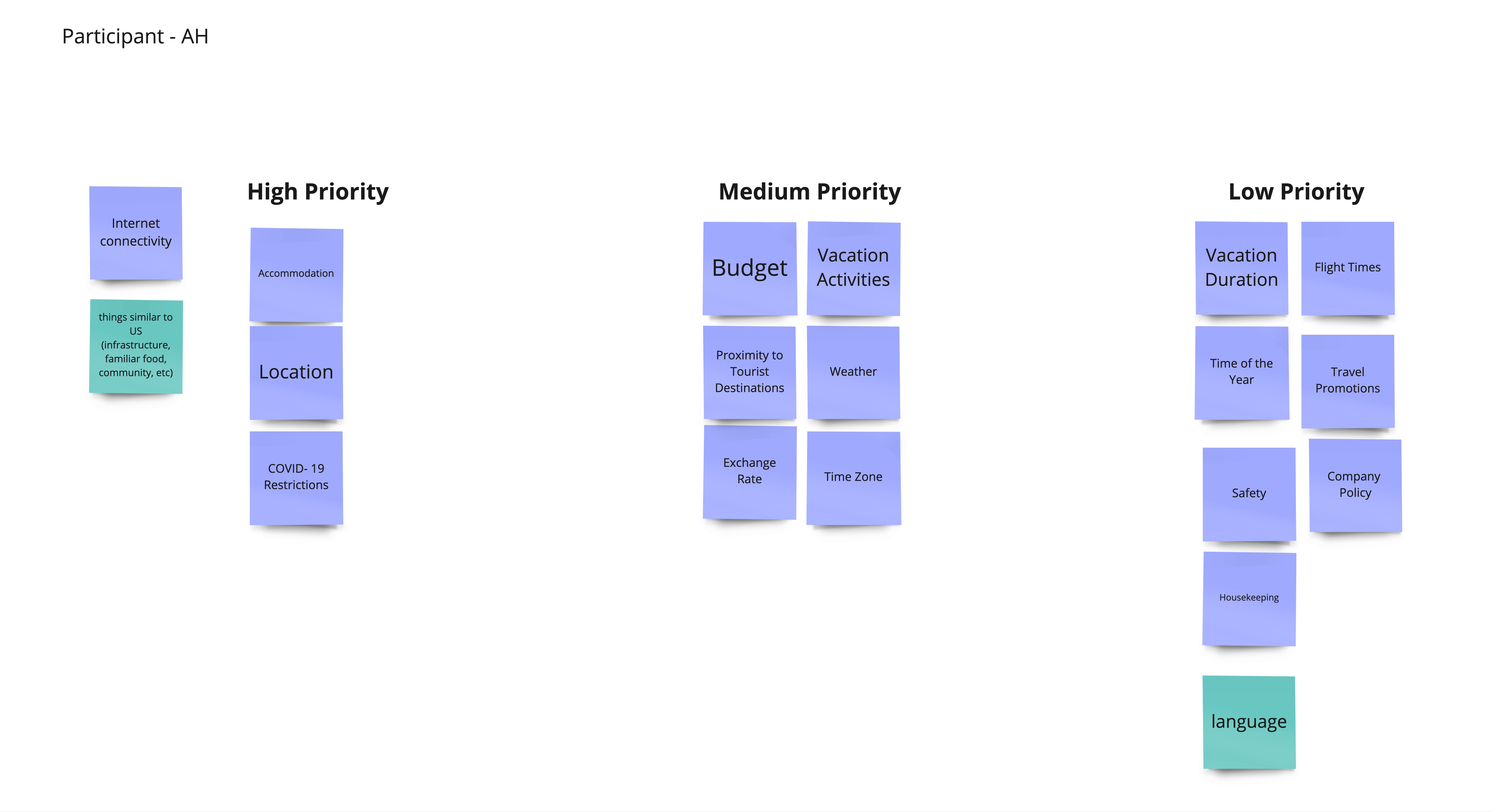
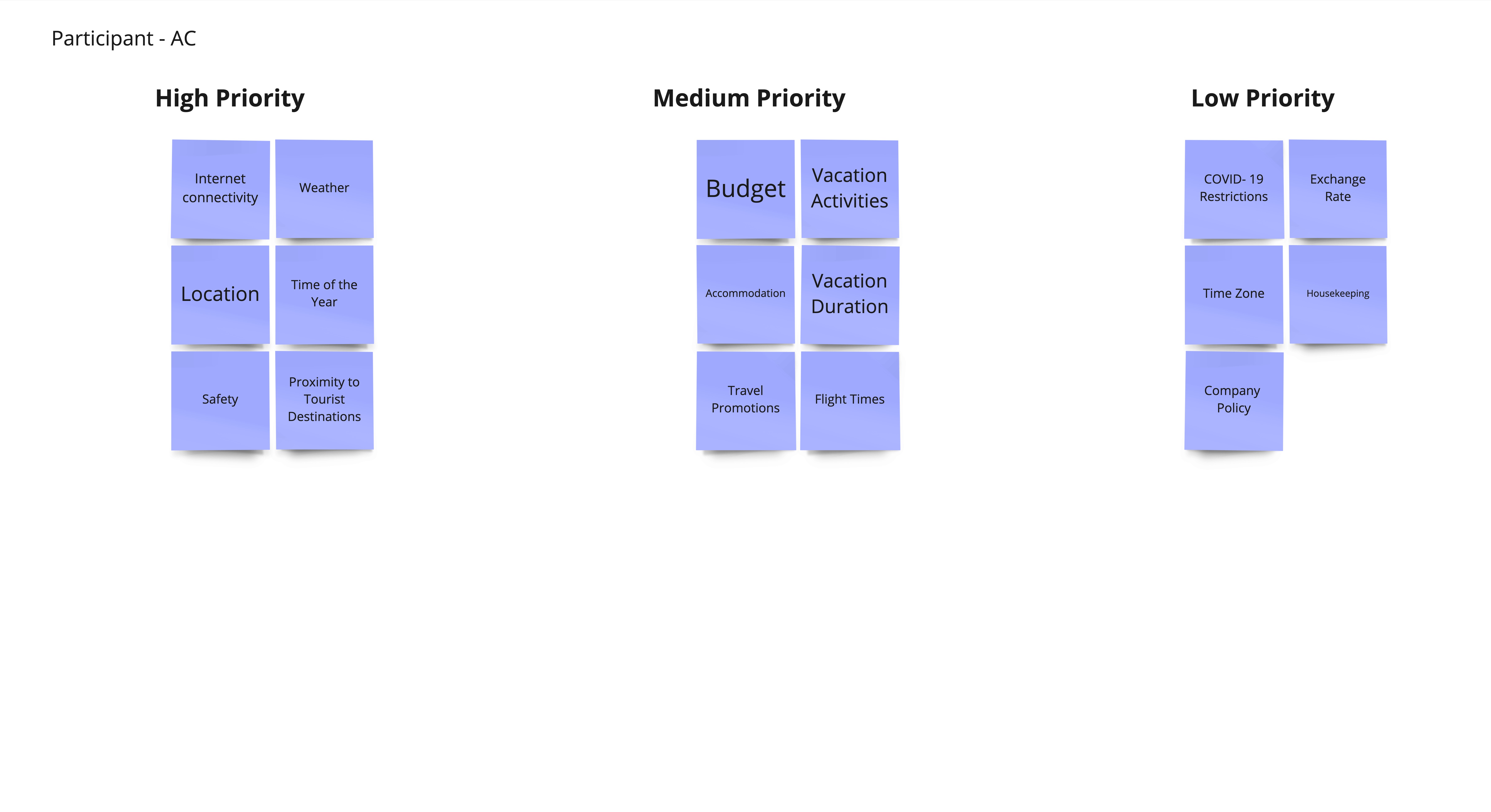
I conducted a combination of directed storytelling and semi-structured interviews with 10 participants with experience going on a workation. Afterward, I had them do a card-sorting activity where they ranked location, budget, and community from highest to lowest regarding factors influencing their trip-planning decisions. This was another way for me to learn how remote workers thought so that we could empathize with their needs when designing.
It was vital for me to walk away from each interview having answers to these specific questions:
-
What are they trying to achieve through their workation? (e.g., fun, experiences, travel)
-
What factors influence their decisions during travel planning for a workation?
-
How do they balance work and leisure time?
- How does their workation experience differ from other travel planning experiences?
Card-Sorting
Engaging our participants in a fun card-sorting exercise, I encouraged them to think critically about their trip-planning choices. They were tasked with organizing specific words or phrases according to their priority, providing an insightful way to openly discuss the reasons behind their preferences for different travel accommodations. The goal was to figure out what remote workers looked for when planning a workation.


Affinity Mapping
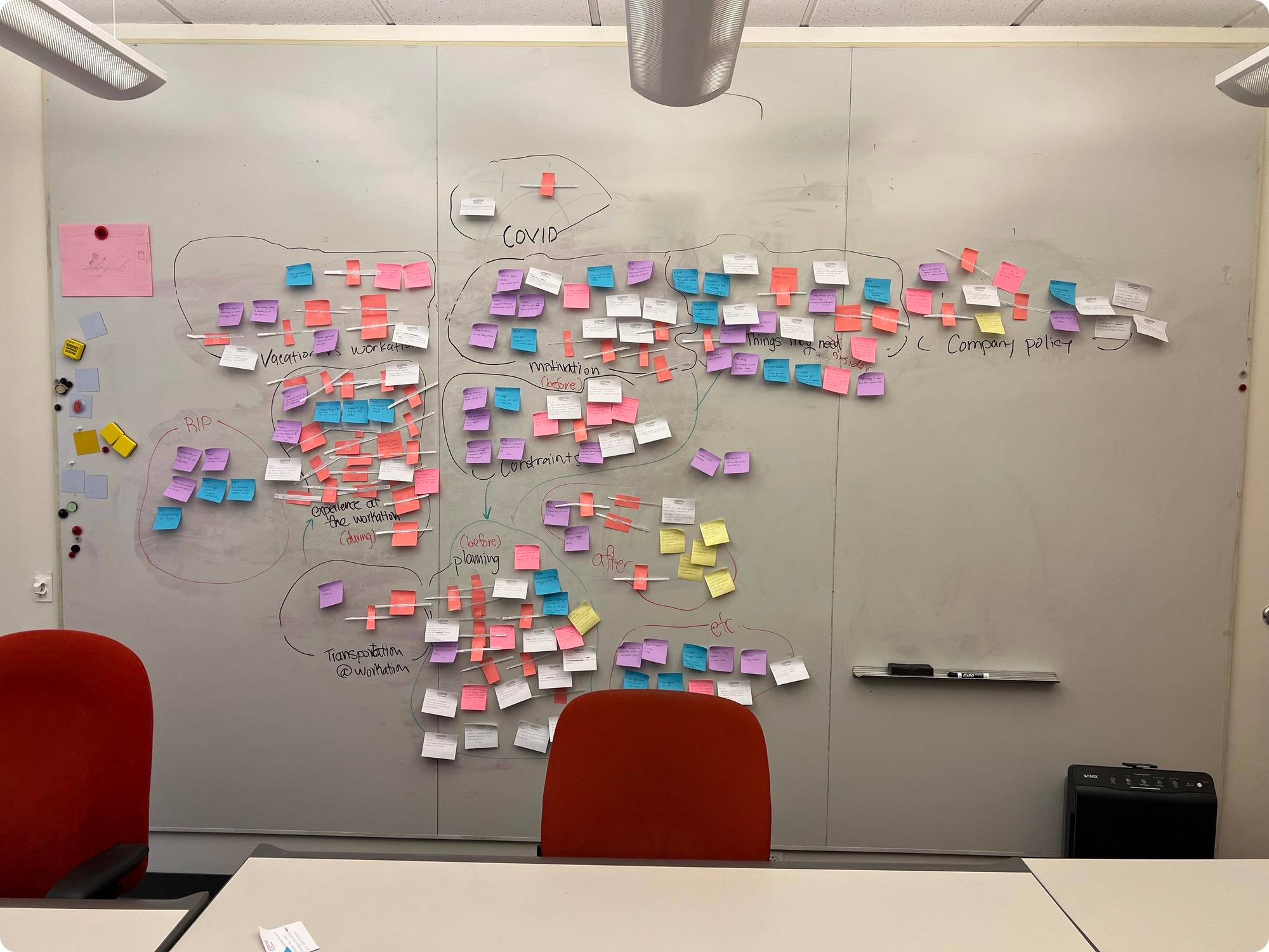
Once I completed my interviews, I analyzed and created interpretation notes used to synthesize an affinity map with my team. My team and I used affinity clustering to group similar interpretation notes together to create an understanding of the data we all collected. Clustering was an excellent opportunity to familiarize ourselves with each other’s notes and brainstorm why specific topics were common as a team. I enjoyed in-person brainstorming sessions because they brought us closer as a team and fostered a more creative atmosphere.
Key Insights
From our research we gathered three key insights:
01
Finding a community is vital on a workation
When planning a workation, travelers considered going to a place where they had friends or could meet and interact with like-minded people who enjoy being outdoors.
02
People on workations use some type of calendar system when working
A majority of individuals, approximately 80%, utilized Google Calendar or a similar organized system to manage their work.
03
People are more open to spontaneity on workations
Remote workers are more reluctant to plan out their workations than regular vacations because they usually stay for an extended time.
Wireframes
In order to test our assumptions I created our final wireframes that highlighted key features that would be used to make planning activities more efficient.

Usability Testing
Iteration #1
I carried out 7 usability tests in which participants were encouraged to verbalize their thoughts while using the calendar application. Following these tests, I conducted semi-structured interviews with the participants who had prior experience planning events on a calendar application. This approach allowed for a comprehensive exploration of user experiences and insights, ensuring a well-rounded assessment of the application's usability and functionality.
Usability Feedback
Importance of balancing the cognitive and visual load of users.
Our effort to put everything on one screen led to an overwhelming UI, making for an unenjoyable experience. The left and right panels over the calendar were confusing to many users because they blocked and took up most of the calendar UI. The coloring of the possible leisure block opens was also demanding on the user’s eyes.
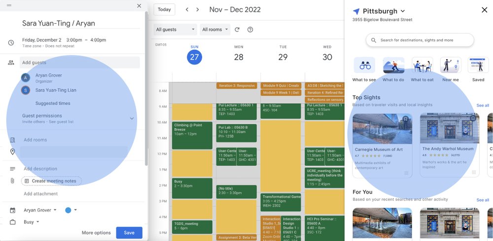

Dragging and dropping feature made the users go through more steps than needed.
Several participants highlighted the unnecessary friction they experienced while trying to drag and drop activities into their calendars while adding an event This insight was a valuable lesson for me, emphasizing that mere differences in functionality do not necessarily equate to improvements in user experience.
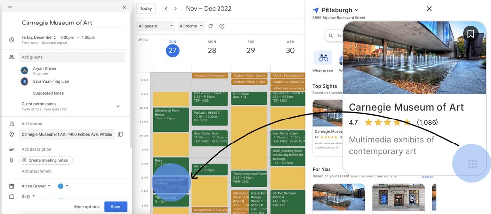
Final Designs

I opted for a neutral color scheme instead of the yellow and green palette we initially used during usability testing. This choice successfully passed accessibility testing and also proved to be visually appealing.
The overload from the two screens left users feeling confused and overwhelmed. To address this issue, I decided to implement a side-by-side layout for the two screens. This design choice provided users with a bit more space and alleviated the sense of being overwhelmed, offering a more comfortable and user-friendly experience.
